The Challenge
Design a cohesive packaging system for multiple flavors that would:
- capture attention in a competitive retail environment
- feel unified as a product line while remaining distinct by flavor
- communicate bold taste and strong character at first glance


The Solution
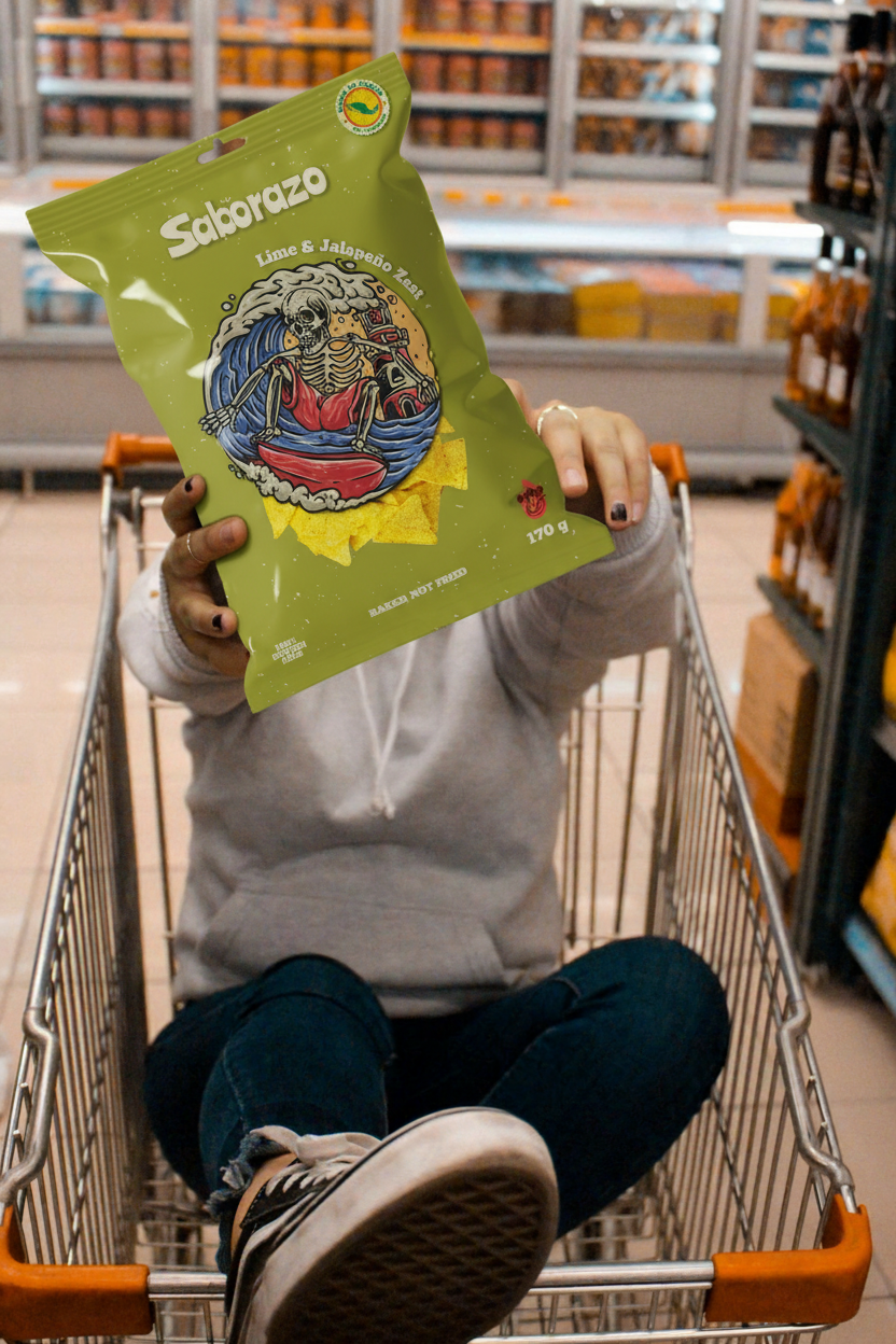
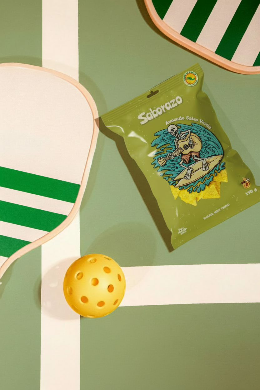
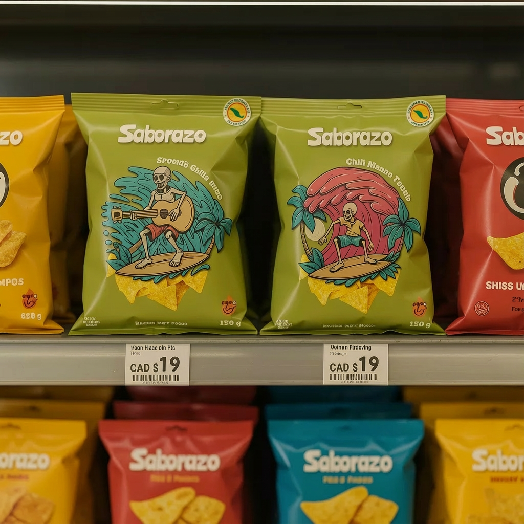
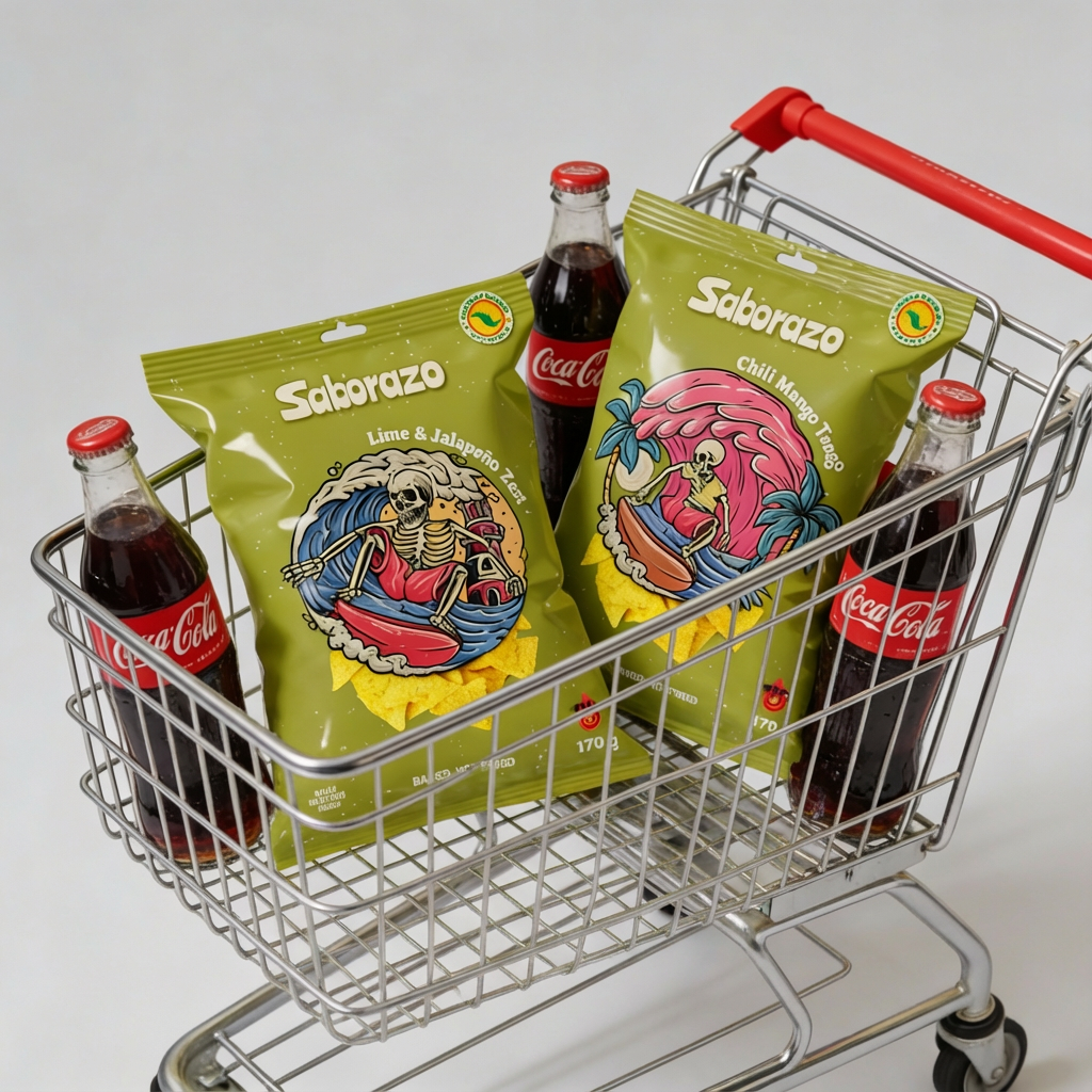
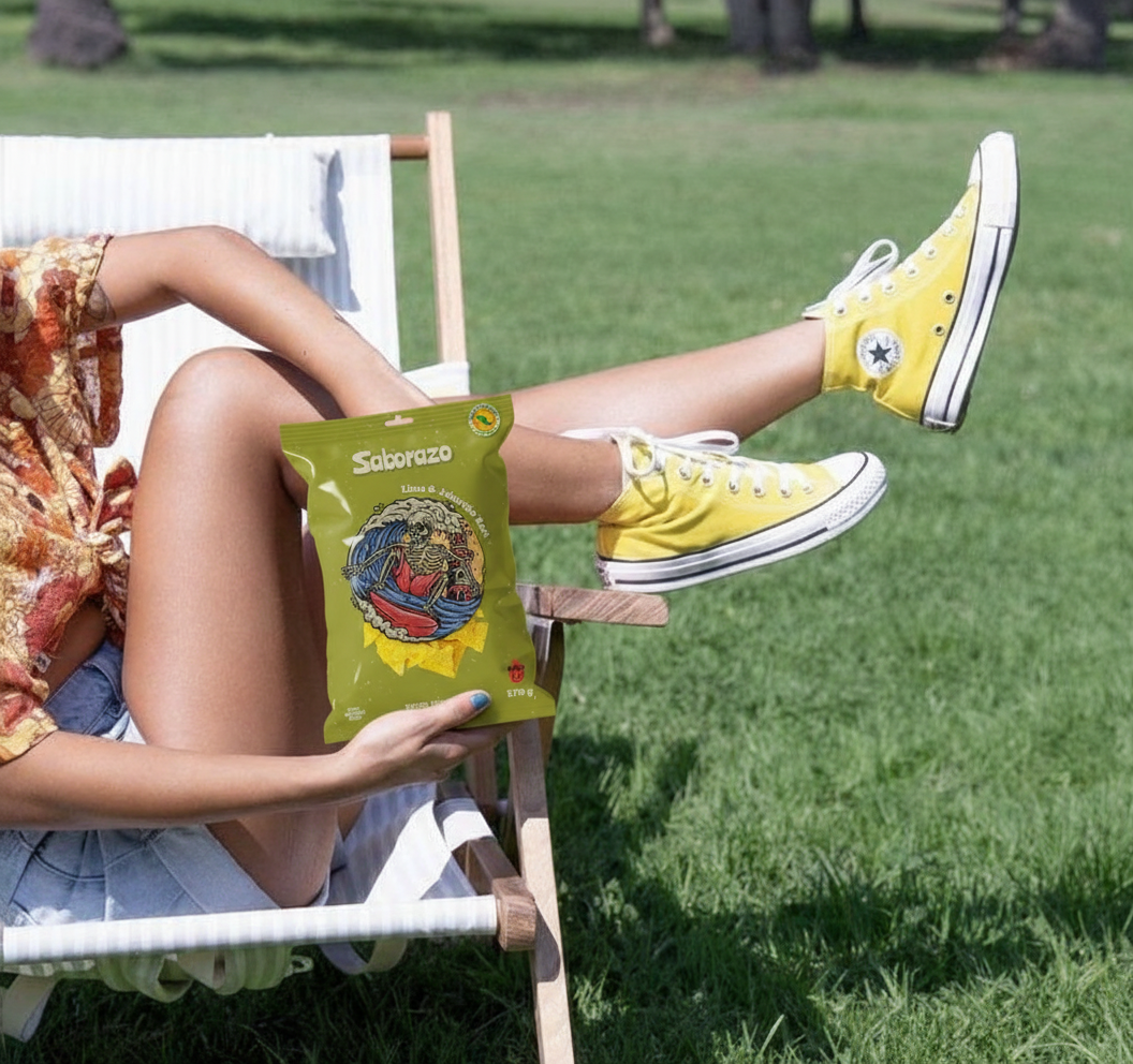
The concept is built around illustrated characters and dynamic scenes, inspired by surf culture, music, and Latin American visual storytelling. Each flavor features its own unique illustration and mood, while maintaining a consistent brand structure and color palette.
The olive-green base color creates strong shelf recognition, while vibrant accent colors and expressive artwork differentiate flavors and add energy. Hand-drawn textures and bold graphics reinforce the brand’s raw, authentic feel.
Result
The final packaging is eye-catching, memorable, and full of personality. It not only reflects the intensity of the flavors but also positions Saborazo as a brand that doesn’t play it safe — one that invites customers to grab, smile, and try something new.
Scope: Packaging design, illustration, visual system
Focus: Retail impact, brand recognition, emotional connection